PROJECT
Valley Suns Logo Design,
NBA G League Branding
SERVICES
NBA G-LEAGUE LOGO DESIGN
TEAM FULL IDENTITY SYSTEM
TEAM BRAND STRATEGY
TEAM BRAND NARRATIVE & STORYTELLING

The Challenge:
The Phoenix Suns organization approached Creature Theory with an exciting challenge—to partner with them to craft the strategic storytelling and dynamic brand identity system for the launch of their new NBA G-League team. The G League exists as the second best professional basketball league in the world, so while being the second team to the NBA’s Phoenix Suns, this new team needed to match that level of excellence and professionalism. This ambitious project required close collaboration with both the Suns' internal team and the NBA, all within a tight timeline.
Execution:
The process began with a comprehensive discovery phase, exploring a wide range of regional, sport, and Suns organization themes, all intertwined with modern basketball and sport culture.
With insights in hand, Creature Theory built the team brand narrative around the concepts of energy, creativity and accessibility. Creature Theory encapsulated the essence of the Valley Suns G-League team as basketball you can feel—a convergence of momentum and explosive action. This is where rising hoops stars compete to become superstars, right before your eyes.
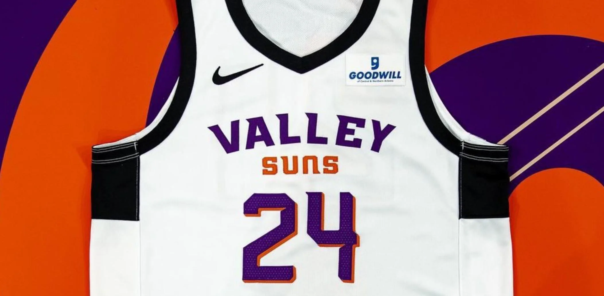
Having developed a robust team brand narrative, Creature Theory pushed forward with an exploration of relevant symbols, iconography and typography styles. At the heart of the new identity system is a 'V.S.' sun logo conveying a sense of motion and fluidity within the construct of something classic—not unlike how we might view pro-level hoops. The visual system nods to the Suns past while looking forward with a style that's electric, modern and brave. A host of functionality objectives and NBA mandates were accomplished to ensure the logo system wasn't just full of Suns swagger, but also easy to use for marketing teams.
A Monogram in Motion
Flickering “V” and “S” flames come together to make a spherical icon representing perpetual energy and rotation, both on and off the court. The sleek, forward-looking design resembles fluid flames and symbolizes the Valley Suns’ dynamic energy and creativity, offering a more kinetic and alive interpretation of the sun.
10 Point Sun
The 10 point sun that functions as a unique holding shape for the primary logo is also reflected in the VS Sun icon. This plays up the team’s radiating energy, within and beyond the court.
Relentless Type
Taking a modern approach to sports typography, the wordmark features custom typography that is strong and confident, while still emphasizing the motion found within the organization, on the court, and in the stands.
Want to learn more?
Let’s talk about your brand or business.
Court layout and image by Valley Suns
Jersey layout and images by Valley Suns


