Kill Devil Rum’s Packaging Is A Maritime Treasure
March 7th, 2025 | By Chloe Gordon | Link to full article at The Dieline below
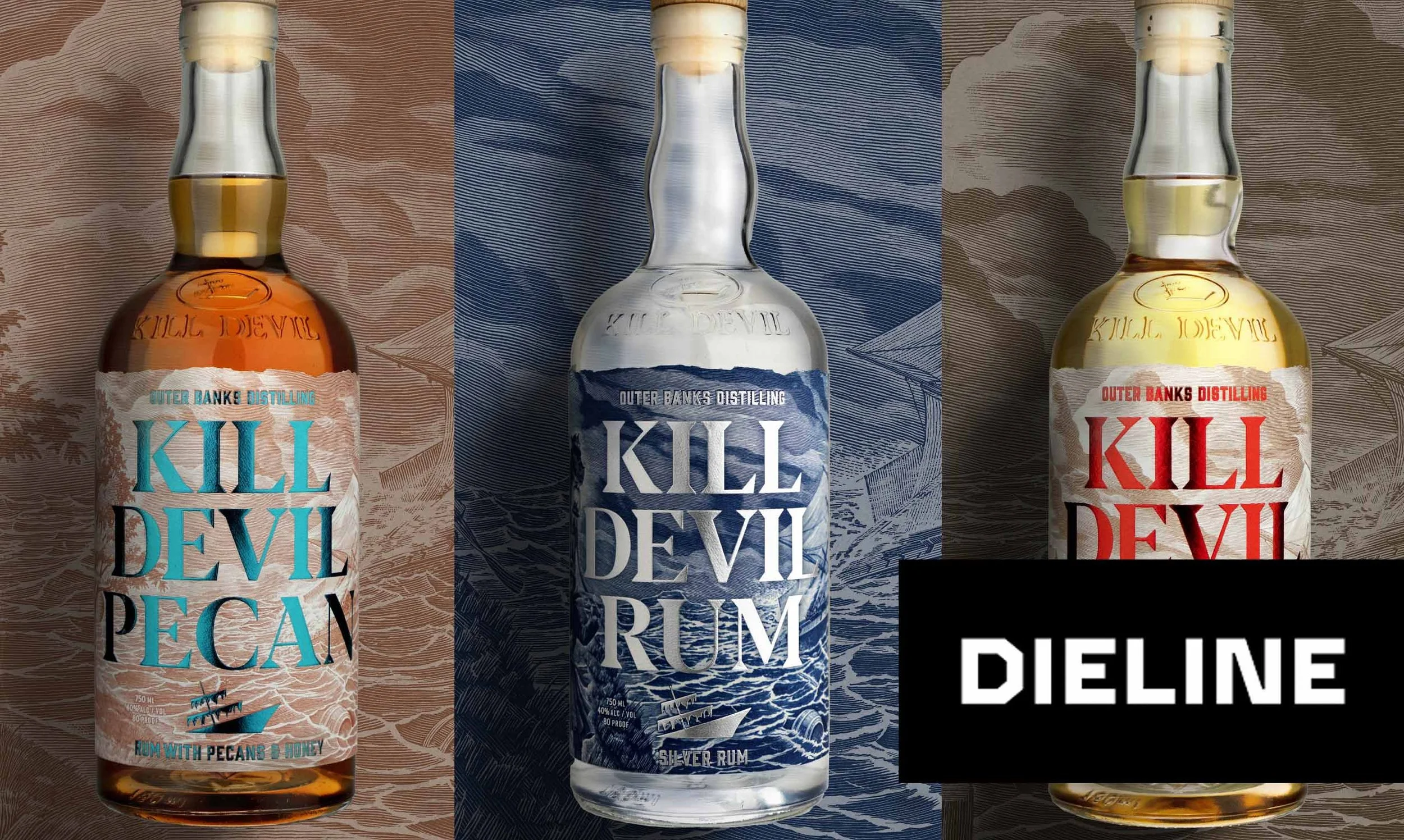
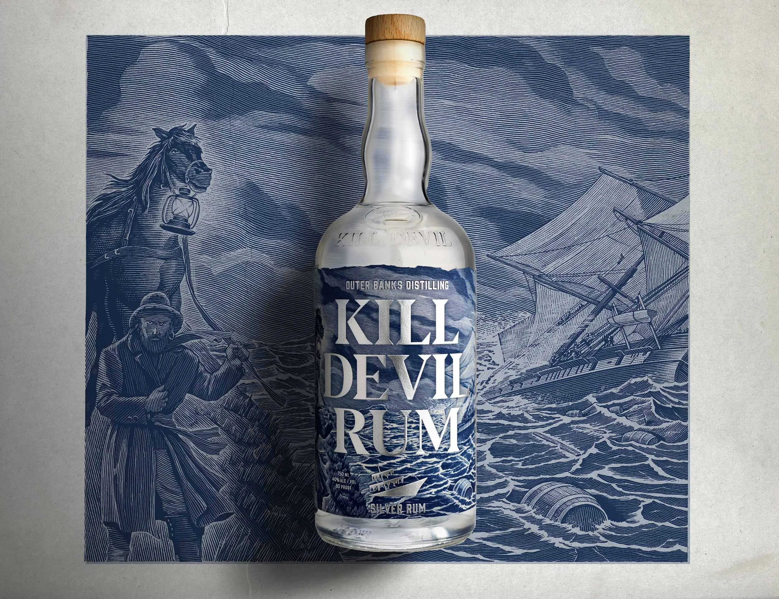
Outer Banks Distilling’s Kill Devil Rum packaging, designed by Creature Theory, leans into its coastal roots through layered textures and foiled typography. The oversized, serif-heavy lettering commands attention, sitting against an intricate backdrop of illustrated ocean waves.
Each variant gets its own color scheme, think deep blue for silver rum, aged gold for the 2-year, and a textured copper for the pecan-infused edition. The bottle caps extend the storytelling with etched details, resembling nautical maps or aged barrels. The whole look is full of movement, echoing the brand’s seafaring inspiration.
We spoke with Matt Ebbing, founder and chief creative director of Creature Theory, about ditching pirate cliches and deep-diving into shipwrecks.
How did you execute the brief and what were some of the strategic design elements that you built into the brand?
Creature Theory began with a deep dive into legitimate historical references for both the place and the spirit type (rum). With a trove of almost-true shipwreck stories to work with and a deep understanding of Caribbean rum making, we developed the label designs to open the door to these stories and history. We found an amazing illustrator who was old school; not only did he work with pen on paper and scratchboard, but he also insisted on mailing final files to us on a USB drive. A sinking ship is the mainstay of every label, being featured as you turn the bottle to the right. On the left side of each label is a spirit-specific illustration to nod to a different story. For example, on Kill Devil Pecan, a special rum made with local pecans and honey, we see a depiction of a southern pecan tree complete with a little honey bee hive.
As previously noted, the client challenged us with some specific tactical considerations, such as readability in a dark bar from a distance. We solved this problem by controlling light and contrast with materials. While some spirit labels make use of metallic foils simply for decoration, we paired highly reflective specialty foils with a textured, uncoated label stock. The color choice and juxtaposing the metallic shine with matte, natural paper yields visual separation and tactile contrast.
Link to full article below

Read more of the article here:
https://thedieline.com/kill-devil-rums-packaging-is-a-maritime-treasure/
About Creature Theory
Creature Theory is a creative agency located in the Cargo District of Wilmington, NC. Founded in 2017, Creature Theory provides diverse strategy, design and advertising services to help develop, evolve and grow brands. The Creature Theory team has decades of experience working with start-ups, growth companies and global brands. Visit www.creaturetheory.com for more information.